We have been painting houses out here for fifty years, and the sun has not gotten any friendlier. A color that looks perfect on a chip in your kitchen can look like something else entirely by the third summer on a west wall in Jurupa Valley. That is not the paint failing. Most of the time that is a color choice that was never going to hold up in this climate, picked under the wrong light, on a chip the size of a playing card.
People ask us what the best exterior color is. There is no such thing. There is a color that suits your house, your roof, your stone, your street, and there is a color that will still look like itself after five summers of Inland Empire sun. Those two things overlap more than you would think, but only if somebody takes the time to line them up before the first gallon gets opened. That is most of what we are doing when we sit down for a color consultation, and it is the cheapest hour anybody spends on a paint job.
Deep Colors Fade Faster, and Here Is the Plain Reason Why
Every gallon of paint is two things mixed together. There is the base, which is the white or clear stuff that makes up the body of the can, and there are the colorants, the concentrated tints the store squirts in to make your color. A soft off-white is mostly base with a whisper of tint. A deep charcoal or a saturated navy or a barn red is a light base loaded up with a lot of colorant, sometimes many ounces of it.
Sunlight breaks down colorant. It does not break it all down at the same rate either. Some pigments, the earth tones and the iron oxides, are stubborn and hold their color for a long time. Others, particularly the bright organic reds, oranges, and some of the violets and deep blues, give up faster. So when you put a heavily tinted color on a wall that gets afternoon sun in Norco or Lake Elsinore, the weaker pigments in the mix burn off first and the color does not just get lighter. It shifts. A deep red goes chalky pink and a touch brown. A rich navy goes dusty and slightly gray-green. A charcoal goes flat and starts looking like a dirty gray primer.
Light colors do not have that problem in the same way because there is not much colorant in them to lose. An off-white with a little yellow oxide in it will lighten a shade over years, and almost nobody notices because there was nothing dramatic there to begin with. That is the whole trick behind why the older houses out here that still look good tend to be the light ones.
Now, we are not telling anybody they have to paint their house beige. There are ways to get real color on a house out here that will hold. The best paints made today use better pigment technology than what we had in the seventies, and the manufacturers publish which colorants they consider durable for exterior use. We ask for that. When a homeowner in Redlands wants a deeper body color, we steer toward the deep colors built on oxide pigments instead of the ones built on the pretty organics, and we tell them plainly what they can expect at year five and year ten. That is the conversation, and we would rather have it up front than have somebody call us disappointed later.
Light Reflectance Value, Explained Without the Chart
Every paint color has a number attached to it called light reflectance value, or LRV. You will find it on the back of the chip or on the manufacturer’s website. It runs from zero to one hundred. Zero is a theoretical pure black that reflects nothing. One hundred is a pure white that reflects everything. Every real color lands somewhere in between.
Here is what that number actually means for your house. A color with a low LRV, say under twenty five, absorbs most of the sunlight that hits it and turns it into heat. On a west-facing stucco wall in Rancho Cucamonga in August, that surface can get startlingly hot to the touch. Heat like that is hard on the paint film, hard on the caulk joints, and hard on any wood substrate underneath. It also gets passed right into your wall assembly.
A color in the mid range, forty to sixty, is where most of the exterior work we do out here lands. It is deep enough to read as an actual color rather than a default, and light enough that it is not cooking itself all afternoon. Above seventy you are into the whites and near-whites, which stay coolest and fade least and are also the least forgiving of a wall that is not dead flat, because bright light on a light color shows every wave and every patch. That matters more than people expect and it is one reason we take stucco surface prep seriously before a light color goes on.
The other thing LRV tells you is whether two colors are actually going to read as different from each other from the street. We see this a lot. Somebody picks a body color and a trim color that are only six or eight points apart on LRV, and on the chips in the store they look clearly different. On the house at forty feet, in full sun, they read as the same color and all that trim detail disappears. If you want your trim to show, you want real separation, generally twenty points or more. If you want the trim to sit quietly and let the body do the talking, you go closer together on purpose. Either can be right. It just has to be on purpose.
Undertones Against the Things You Are Not Repainting
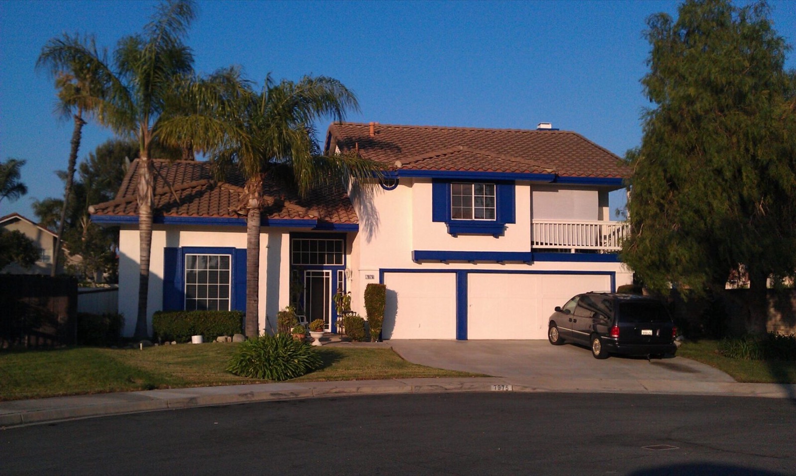
This is where more color choices go wrong than anywhere else, and it has nothing to do with fade. Your house already has colors on it that are not changing. The tile roof. The stone or brick veneer at the base of the columns. The concrete driveway and walkway. The window frames, if they are bronze or tan vinyl. The garage door if it is staying. Whatever color you pick has to live next to those things for the next decade.
Most of the tile roofs around here run warm. Terracotta, blended browns and rusts, sometimes a mission red. Warm roofs want warm undertones underneath them. Put a cool gray body color with a blue undertone under a warm terracotta roof and the two will fight. The gray will look faintly purple, the roof will look oddly orange, and nobody will be able to tell you why the house looks off. It is a very common mistake and it happens because the homeowner picked the gray in a showroom with no roof in sight.
Same story with stone veneer. Look hard at the stone. Really look. Is there a gold cast in the mortar? Is there gray-green in the darker stones? Whatever is dominant in there needs an echo in the body color or the trim, or the stone will look like it was stuck on from a different house. The manufactured stone that went up on a lot of Inland Empire homes in the nineties and two thousands tends to run gray-brown with a warm mortar, which actually opens up more options than people assume.
Concrete is the one people forget entirely. Your driveway is a large gray plane sitting right at the bottom of your composition, and it is usually a cool gray that has yellowed slightly with age. It affects how the lower third of the house reads. We stand in the street with the homeowner and just look at all of it together before anybody talks about a color name. Getting the undertones right is exactly what accurate color matching work is for, and it is the difference between a house that looks composed and one that looks assembled.
The Sun Side and the Shade Side Will Not Age Together
Here is something you learn after enough years of coming back to houses you painted. The south and west elevations of a house take a beating that the north and east sides never see. On a two-story in Upland with a long west wall, that wall might get six or seven hours of direct hard sun in the summer. The north side of the same house might get almost none.
The result, five or six years down the road, is that the same paint from the same batch has aged into two slightly different colors on the same house. It is subtle from the street and obvious at a corner where the two walls meet. The deeper the color, the more obvious it gets. On a light body color, it is often invisible. That is one more argument for the mid-range colors if you want the house to age evenly rather than looking like it was painted in two sessions.
It also means touch-up work on a sun side never quite matches, even out of the original can, because the wall has moved and the can has not. When we come back to a house we painted years ago and somebody wants a section fixed, we tell them straight that the honest answer is usually to paint the whole elevation, corner to corner. A patched section will show. We are not going to charge somebody for a repair we know is going to bother them every time they pull into the driveway.
The practical takeaway for color selection is this. Pick a color you would be happy with a little bit softer than the chip, because the sun sides are going there. If the chip is already at the edge of what you like and any lightening would ruin it for you, that color is the wrong pick for this climate. Go one step deeper so the fade lands you where you wanted to be.
Why We Sample Large, on Your Wall, Morning and Evening
We will not let a homeowner commit to an exterior color off a chip. We have seen too many people spend real money on a color they picked in a store under fluorescent lights and then hate on the second day. So we put samples on the actual wall, and we make them big. Two feet by two feet at minimum, and we put them on more than one elevation.
Small samples lie. A three inch chip surrounded by white paper reads much darker and much more saturated than the same color spread over an entire wall. Color on a large field gets lighter and more intense, so the beige that looked safe on the chip can read as a bright tan across a whole two-story face. There is no way to correct for that in your head. You have to see it big.
And you have to see it at more than one time of day. Morning light out here is cool and clear and comes in low from the east. Late afternoon light is warm, gold, sometimes almost orange, and it is coming in hard from the west. A gray that looks perfectly neutral at nine in the morning can look distinctly lavender at six in the evening. A greige can go full beige in the afternoon sun. Overcast days, which we get a handful of in the winter, are a third look entirely. So we ask people to live with the samples for a couple of days and look at them with their morning coffee and again when they come home from work.
One more thing about samples. Put them next to the stone and next to the roofline, not out in the middle of a blank wall. The whole point is to see the color against the things it has to live with. And if the wall is being repaired or re-textured before paint, we sample on a piece of the repaired surface, because a sample over old chalky paint will not tell you the truth about how the finish coat is going to look. Same reason we are particular about what primer goes down first on a color change.
Colors That Age Well on Stucco Around Here
Most of what we paint in the Inland Empire is stucco, and stucco has its own personality when it comes to color. It is a textured surface, so it holds shadow. That means every color on stucco reads slightly deeper and more complex than the same color on smooth siding, because you are seeing the color plus a thousand tiny shadows. A flat sheen, which is what belongs on stucco almost every time, adds to that.
The colors we see hold up best on stucco out here are the warm neutrals with some complexity in them. Soft greige with a warm bias. Sand and putty tones. Warm off-whites that are not stark, because a pure bright white on stucco in this sun is genuinely hard to look at in the afternoon and it shows every hairline crack. The mid-tone warm grays do well too, provided the undertone is not fighting the roof.
What struggles on stucco out here, in our experience: the very deep saturated colors, for all the reasons above. The cool blue-grays, unless the roof and stone support them, because they tend to go flat and cold and read as institutional after the color drops a notch. And the trendy near-black bodies that have been going around, which look sharp for two summers and then look tired, and which turn a west wall into a griddle.
None of this is a rule you cannot break. We have painted houses in colors we would not have suggested and they looked terrific, because the homeowner had a clear eye and the house supported it. But we tell people what we have seen. That is what fifty years is good for. When we walk a house before an exterior repaint, we are looking at how the last color aged as much as we are looking at what shape the surface is in, because the last color is a free ten-year test on that exact wall.
When the Bold Color Belongs on the Door Instead
A lot of people who come to us wanting a dramatic house actually want a dramatic front entry. They just have not separated those two ideas yet. And the front door is the right place to put the color you love, for three good reasons.
First, it is small, so a saturated color there reads as a deliberate accent rather than a commitment. Second, most front doors around here sit under a porch or a recess, which means far less direct sun, which means that saturated color will hold for years longer than it would on an open wall. Third, and this is the practical one, a door is a couple of hours of work to change your mind about. A whole house is not. If you get tired of the color in four years, you repaint the door on a Saturday.
The doors that stop people on a walk are the deep ones. A real navy. A deep forest green against a warm neutral body. A proper black on a house with white trim. Some people go the other direction with a clean saturated teal or a deep coral against a sand body, and when the undertones are set up right it looks like the house was designed around it. We do a fair amount of front door work as its own small job, sometimes for people who are not repainting anything else, and it is one of the highest-payback few hours anybody spends on the front of a house.
The rule we go by is one voice at a time. If the body is doing something bold, the door should be quiet. If the body is a well-chosen neutral, the door can carry the whole personality of the house. Two bold moves fighting each other reads as busy from the street, and busy is the one thing that makes a nice house look cheap. You can see how this plays out across a lot of different homes in our project gallery, and it is usually the restrained ones that have aged best.
What We Do Before Anybody Picks a Number
When we come out to look at a house, we are not there to hand somebody a fan deck and leave. We walk the whole exterior. We look at which walls are eating sun and which are not. We look at the roof and the stone and the concrete together in daylight. We check what the last paint did as it aged, because that tells us more than any chip will. We look for the wood that needs attention before anything gets a coat, because a beautiful color over a soft fascia board is money thrown away and we will say so. If there is rot to cut out and replace, that gets handled first, always.
Then we talk about what you actually want the house to feel like. Quiet and settled, or striking. Warm or cool. Matching the neighborhood or standing apart from it a little. Those answers narrow a wall of chips down to five or six candidates fast, and then we sample the finalists on your wall and let the light decide.
We also use the manufacturer specified amount of paint on every job we quote. Every single one. We started doing that a long time ago because the outfit John worked for early on would use half the paint they were supposed to and pocket the difference, and that never sat right with him. Thinned-out paint on a west wall in this valley will show you exactly what it is inside of three years. Doing right by everybody means you can check our work with your own two eyes, on the driveway, before we pull out.
Getting a Ballpark on Your Exterior
If you are somewhere between wanting a new color and knowing what it should be, that is a fine place to start from. Come see us at our contact page or call the shop at (951) 685-1595 and we will come walk the house with you, look at the roof and the stone in real daylight, and give you a straight ballpark built from the real square footage. No pressure and no charge for the walk. We work Riverside and San Bernardino counties, Redlands to Yucaipa to Chino Hills, and we would rather talk you into the right color than sell you the wrong one twice. Send us a note whenever you are ready.